

Blog
How to read a live crypto signal map
A bubble is a coin whose order book is doing something right now. Size means money, color means event type, and disappearance is information too. Here is how our live map and market page work — and how to use them without the magic.
An alert feed is an honest but exhausting format: events arrive one after another, and half an hour in you no longer remember how it started. A map solves the same problem differently. It doesn't answer "what just happened" — it answers "where is something interesting happening right now." One glance tells you which coins are alive, how much money is involved, and what is already cooling off.
Below is how both of our maps work — the live signal map and the market map — and there is no magic in either of them. That's probably the most important thing to understand about them.
A bubble is an order-book event, not a "promising coin"
On the live map, a bubble appears only when our detectors notice something: a large resting limit order, robotic flow of identical trades, a liquidity sweep with a snap-back, or price pushing. No event — no bubble. That's why the map can be nearly empty during a quiet hour. It isn't broken; it's telling the truth. Nothing is happening.
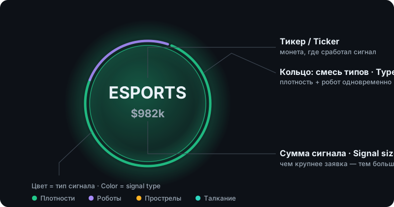
Bubble size is money. The number inside is the dollar size of the coin's largest active signal: an $800,000 wall draws noticeably bigger than a $200,000 one — but not four times bigger, or a single three-million-dollar order would swallow the whole screen. We compress the scale so that large reads as large and everything else stays visible.
Color is the event type. Green for liquidity walls, purple for robots, amber for spikes, teal for pushing. When several types fire on one coin, a ring chart appears around the bubble — you can see at a glance that, say, the wall is the main story here and the robot is background noise.
Appearing and disappearing are data too. A new bubble is literally towed onto the map from the edge — that is the moment a signal just fired. And when a bubble pops, the event has stopped being real: the order was pulled from the book, or the signal aged out. We deliberately give different types different lifespans. A wall lives as long as the order itself stands — up to an hour. Robots, spikes and pushing are point-in-time events; ten minutes later they are history, and the map lets them go. A popping bubble isn't decoration. It's a message: "this is no longer in the market."
What's inside a click
Clicking a bubble opens a card of facts — the same ones Telegram members see at the moment the signal fires: direction, exchange, order size in dollars, its price, how many minutes the wall has been standing, the one-minute move, distance from the spread, hourly traded volume. Below that, a live chart and the coin's events from the last hour.
Notice what the card does not contain: the words "buy" or "sell." A $980,000 wall standing for twenty minutes half a percent from price is a fact. What it means for your position is a question for you, not for us. We've written before about why a wall is not a reversal guarantee; the map doesn't repeal that principle — it just gets you to the facts faster.
The market page: a different question, a different map
The market map answers a different question — not "where is the order book alive" but "who is moving today." It shows the fifty biggest movers of the selected period, gainers and losers alike. Bubble size is the magnitude of the move; color is its direction — green rising, red falling. A coin that did +300% in a day draws huge, and that's correct: it's the first thing you would have looked at anyway.
Below the map sits a table of a thousand coins with prices, market caps and volumes. Clicking a row or a bubble opens a card with key stats and a chart. There are no detectors here — this is plain market data refreshing every couple of minutes. We keep the two maps side by side on purpose: the market page shows what already happened to price, while the live map shows what is happening in the order book — often before price has reacted.
How to actually use it
Here is roughly how we look at it ourselves.
First glance — the whole picture: how many bubbles, which colors dominate, is anything big out there. An empty map is also an answer: you can relax. Second glance — the large bubbles: click, card, chart. The questions are always the same: has this wall been standing for a while, or did it appear a second ago? How far from price? What have trades around it been doing? Third glance — cross-reference with the market map: when a coin is simultaneously among the day's top movers and has a large wall living in its book, that's a story, not a coincidence.
What you shouldn't do is treat every bubble as an invitation to trade. The map shows where money and attention have concentrated. From there, the work is yours — and no visualization will do it for you.